Contract House LLC
Newport, Rhode Island — 2026
Logo, color system, typography, accessibility guidelines, business cards, and letterhead
The Brief
ContractHouse LLC is a Newport-based law firm built around a simple proposition: AI-assisted drafting, attorney-reviewed results, flat-rate pricing. No hourly billing, no surprises. Legal counsel designed for founders, freelancers, and small business owners who need real legal work done at a price that makes sense.
The founding partners — Maxwell Holland and John Feeney, both formerly of traditional firms — came to me with nothing but a name and a clear point of view about what they were building. The design challenge was to make that point of view legible at a glance: a firm that is modern and technology-forward, but grounded enough that a small business owner trusts them with something that matters.
The Design Problem
Law firm branding tends to fall into two failure modes: the legacy firm aesthetic (dark wood, serif type, Latin mottos) that signals authority but not approachability, or the legal tech startup aesthetic (bright gradients, sans-serif everything) that signals innovation but not trustworthiness. ContractHouse needed to sit between those two — a firm that takes the work seriously and uses technology as a tool, not a gimmick.
Identity System
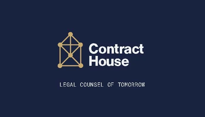
The logo mark is a structural node diagram in the form of a house — referencing both the firm's name and the interconnected nature of legal agreements: every contract is a network of obligations, relationships, and dependencies. The mark works at multiple scales, from business card to letterhead header, and holds in three color treatments across the full palette.
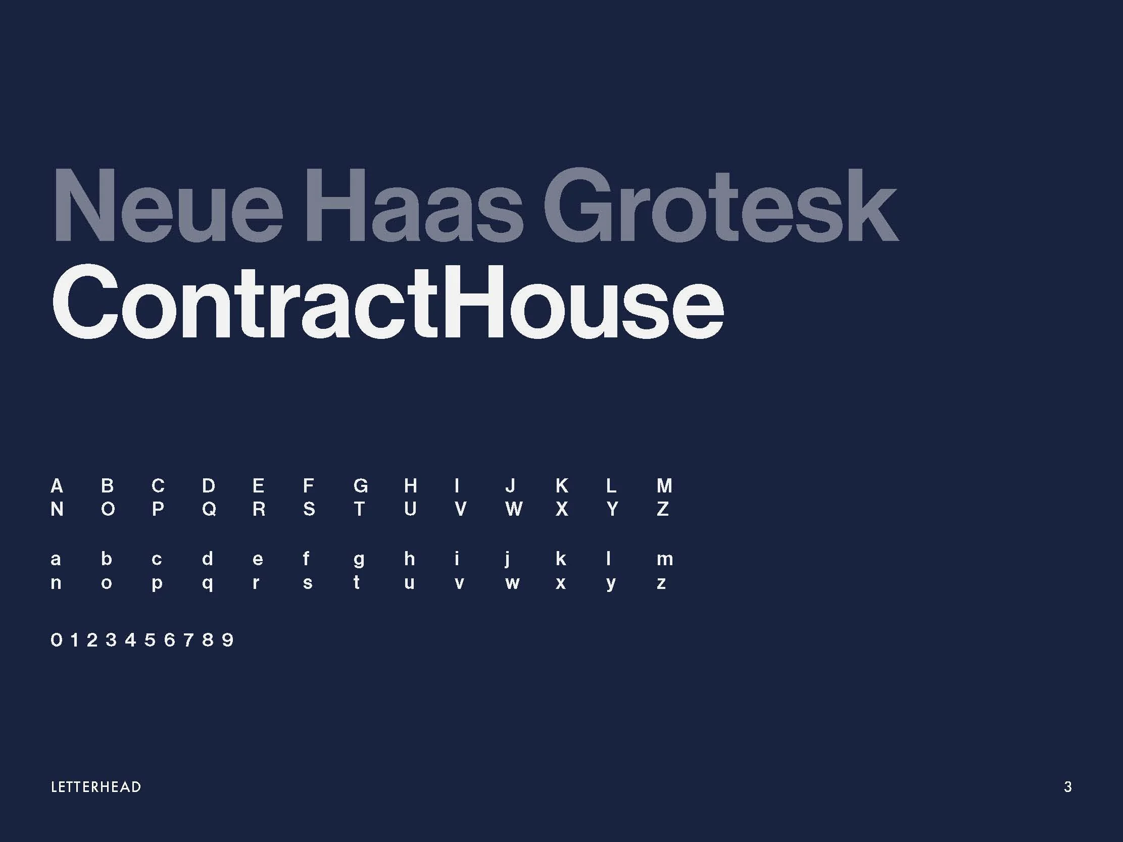
Neue Haas Grotesk was chosen as the primary typeface for its combination of modernist clarity and quiet authority — legible and clean at body copy sizes, commanding at display scale. It reads as contemporary without performing novelty.
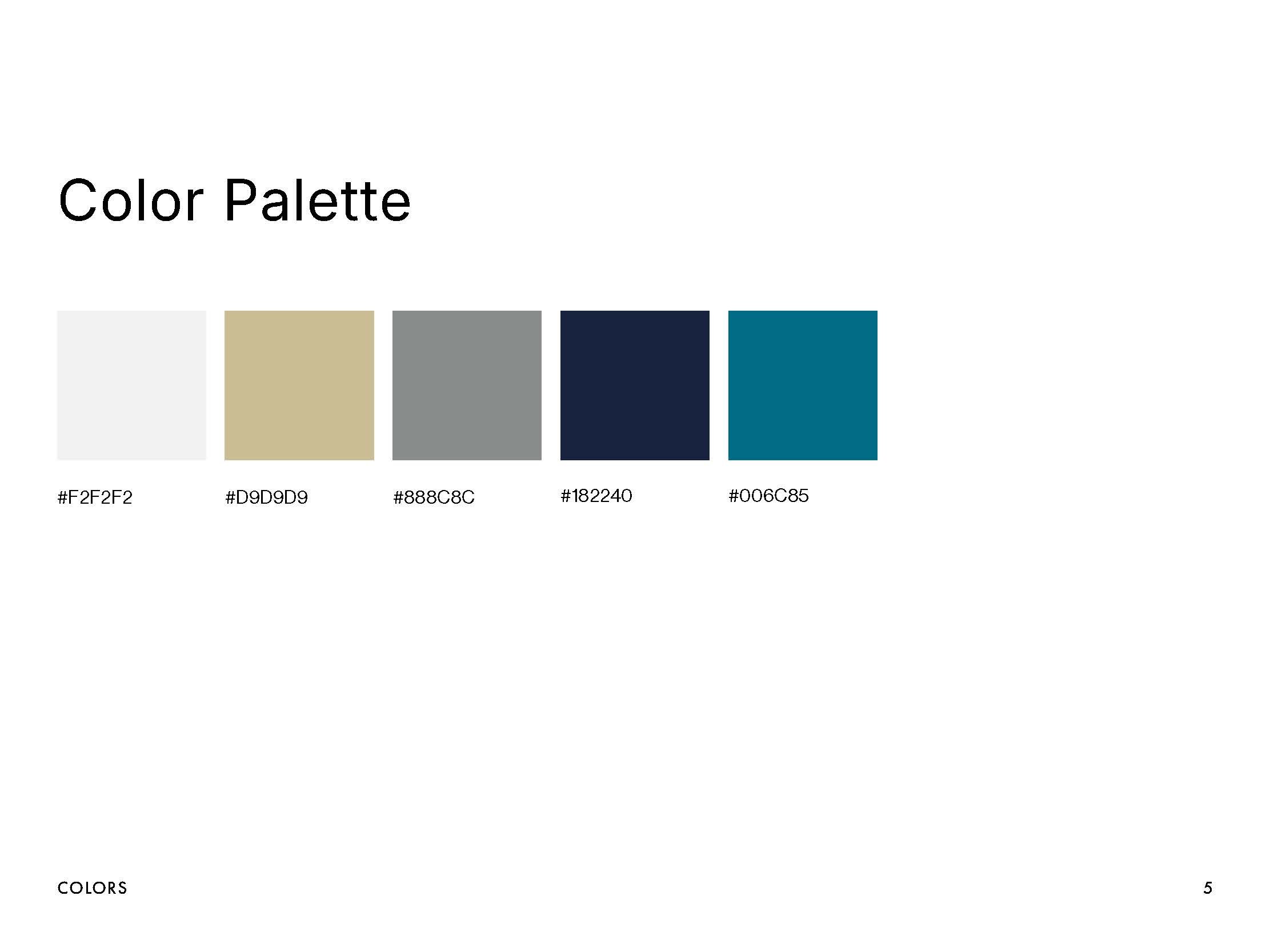
The color palette anchors in deep navy and warm gold — a combination that signals professionalism and permanence — expanded with an optional teal accent for a forward-looking secondary presence, and a neutral gray range for flexibility across document types.
The accessibility guidelines document tested all color combinations against WCAG contrast standards — an especially relevant consideration for a firm whose clients will encounter the brand across legal documents, digital interfaces, and printed materials.


Applications
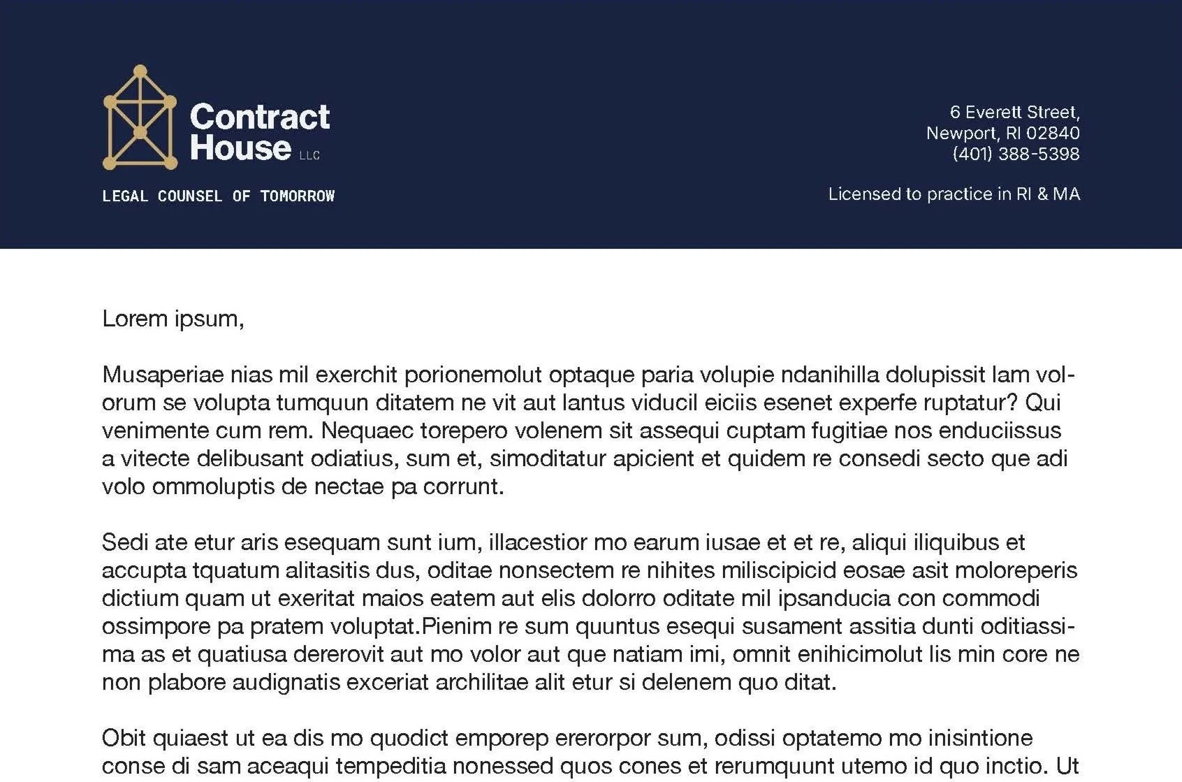
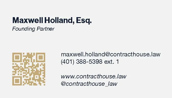
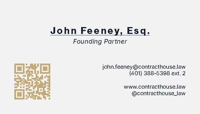
Business cards and legal letterhead complete the identity system, translating the brand into the two primary surfaces where ContractHouse makes its first impression — a potential client receiving a card at a meeting, or opening a document that begins a formal legal engagement. Both applications were designed to feel considered and institutional without the stuffiness of traditional legal branding.